PROJECT
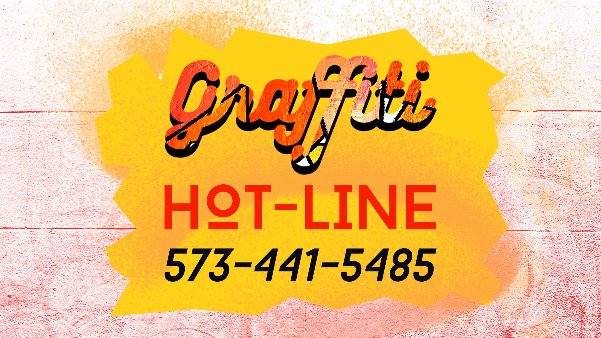
Graffiti Hotline Digital Banner
Shades of yellow, orange and red for a graffiti reporting hotline.
ROLE:
Concept, Design, Illustration
CLIENT:
City of Columbia
DELIVERABLE:
Video/Web/Social Media

Challenge:
The funny part of designing a title about graffiti is that one immediately thinks about using graffiti art as part of the design. In fact, I created a video title about graffiti that used a typeface similar to graffiti. I used an effect that painted it on and then off. The challenge in this case was to create a still compelling visual image informing the public about the hotline, without graffiti in the title.
Solution:
I chose yellow, red, orange and black to signify danger, halt, beware. Although the final product has an elegant feel the intensity of colors is designed to rouse viewers into action.
